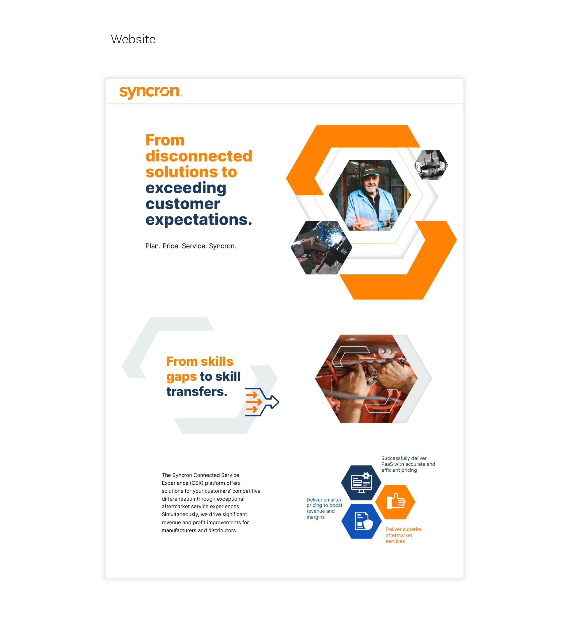
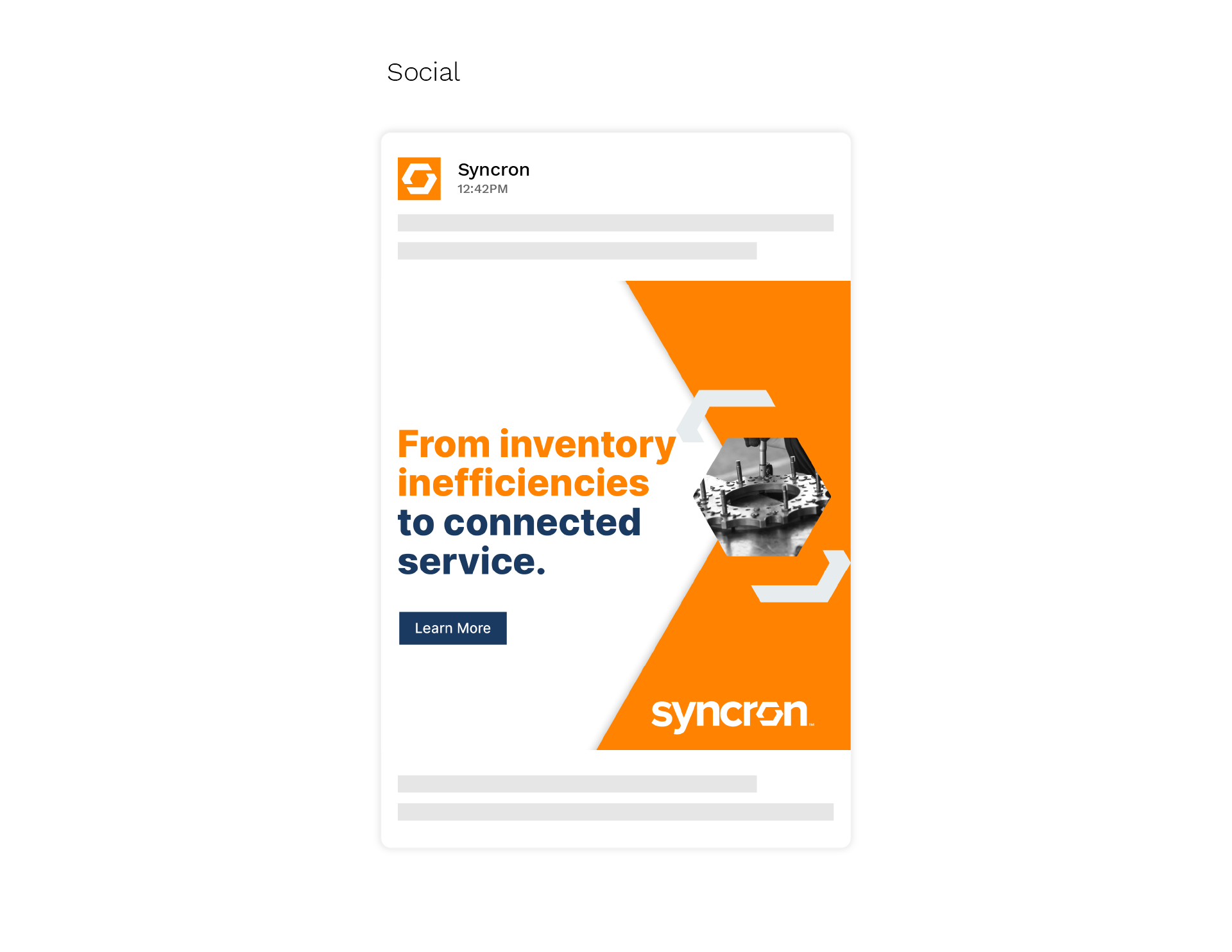
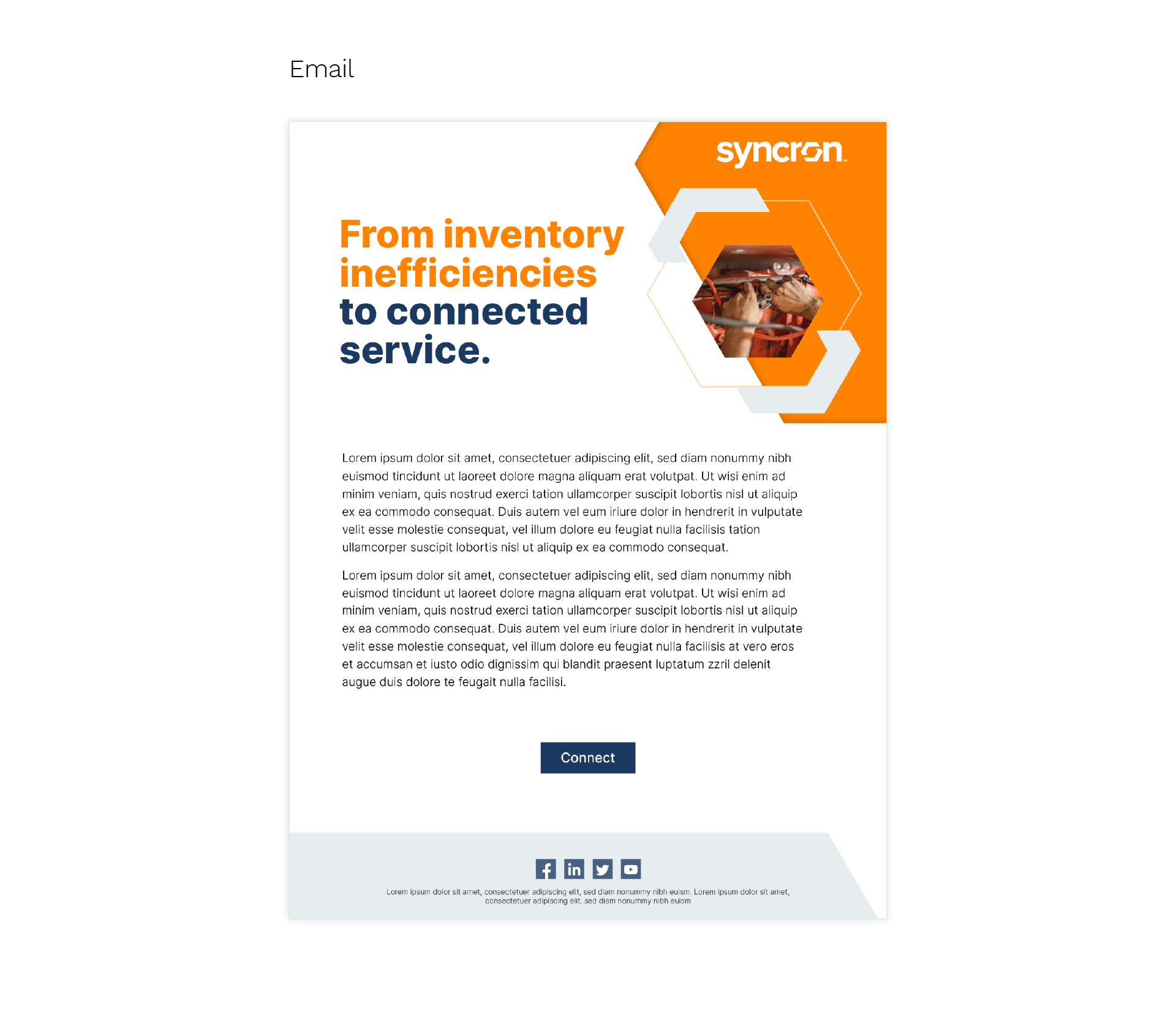
Syncron brand refresh
Syncron came to the Agent3 Group for an updated messaging strategy and brand refresh with industrial equipment manufacturers as their first target audience. I created a look inspired by the connection that Syncron's services provide throughout the product lifecycle. This visual direction has been used across multiple campaigns and various marketing assets.
Agency: This Machine + Agent3 (strategy)
Creative director and designer: Kaitlyn Castellow
Copywriter: Jenna Allen
Creative director and designer: Kaitlyn Castellow
Copywriter: Jenna Allen
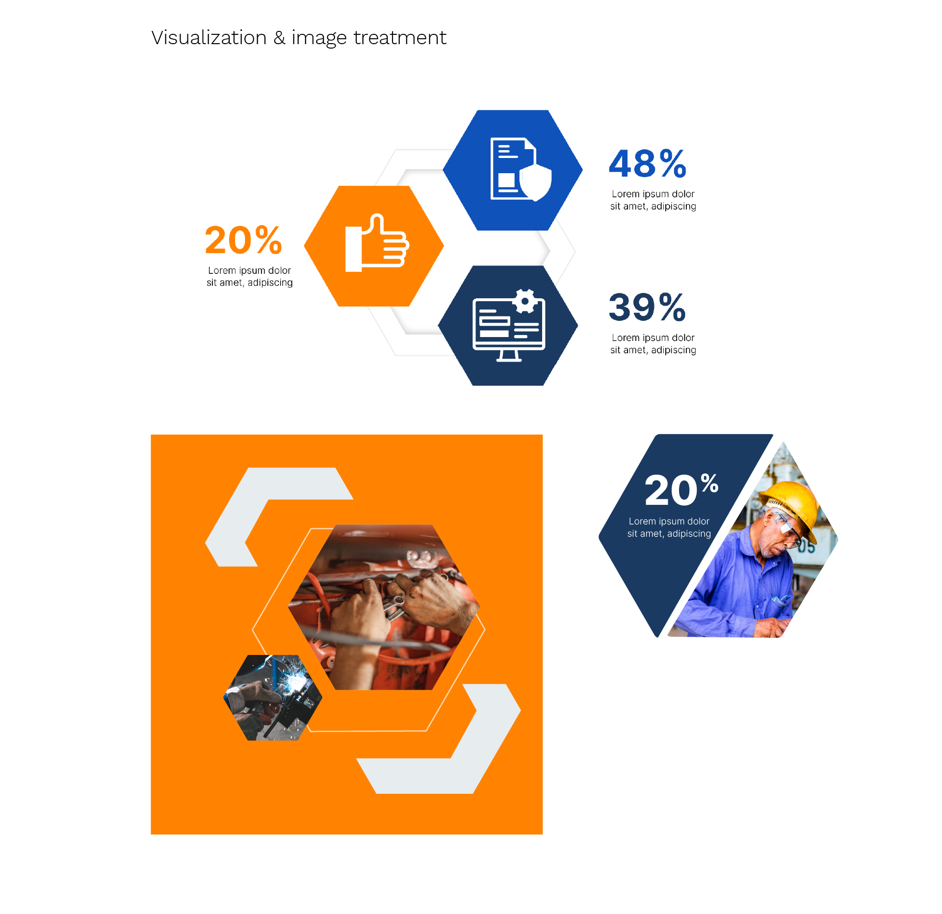
I use the two parts of the "o" in Syncron's logo as "links" to connect different visual elements or messages to help tell the broader story of connection. The links and hexagon shapes used in this look are reminiscent of the machinery their customers are working with. This direction uses a toned-down color palette of just Syncron's primary orange and two shades of blue which gives it a stronger, more industrial, and professional look, and uses two tones for headlines to highlight the solutions that Syncron provides.